Circos Plots
Circular layouts provide a unique and powerful way to visualize large, complex datasets. Originally popular in genomics, they are exceptionally well-suited for any data where relationships between groups or trends within structured categories need to be observed simultaneously.
Why Circular?
Circular plots enable the visualization of hundreds of data points while maintaining readability. By using a circular coordinate system:
- Tracks allow for layering multiple sets of information (e.g., different phenotypes or cohorts).
- Sectors allow for grouping variables into meaningful categories (e.g., metabolite classes or biological pathways).
- Efficiency: They maximize use of the display space compared to traditional linear plots.
EpiViz
EpiViz is an R package designed to streamline the
creation of Circos plots specifically for epidemiologists. It acts as a
high-level wrapper around the powerful circlize and
ComplexHeatmap packages.
How it works
Circos plots in EpiViz are composed of several key elements:
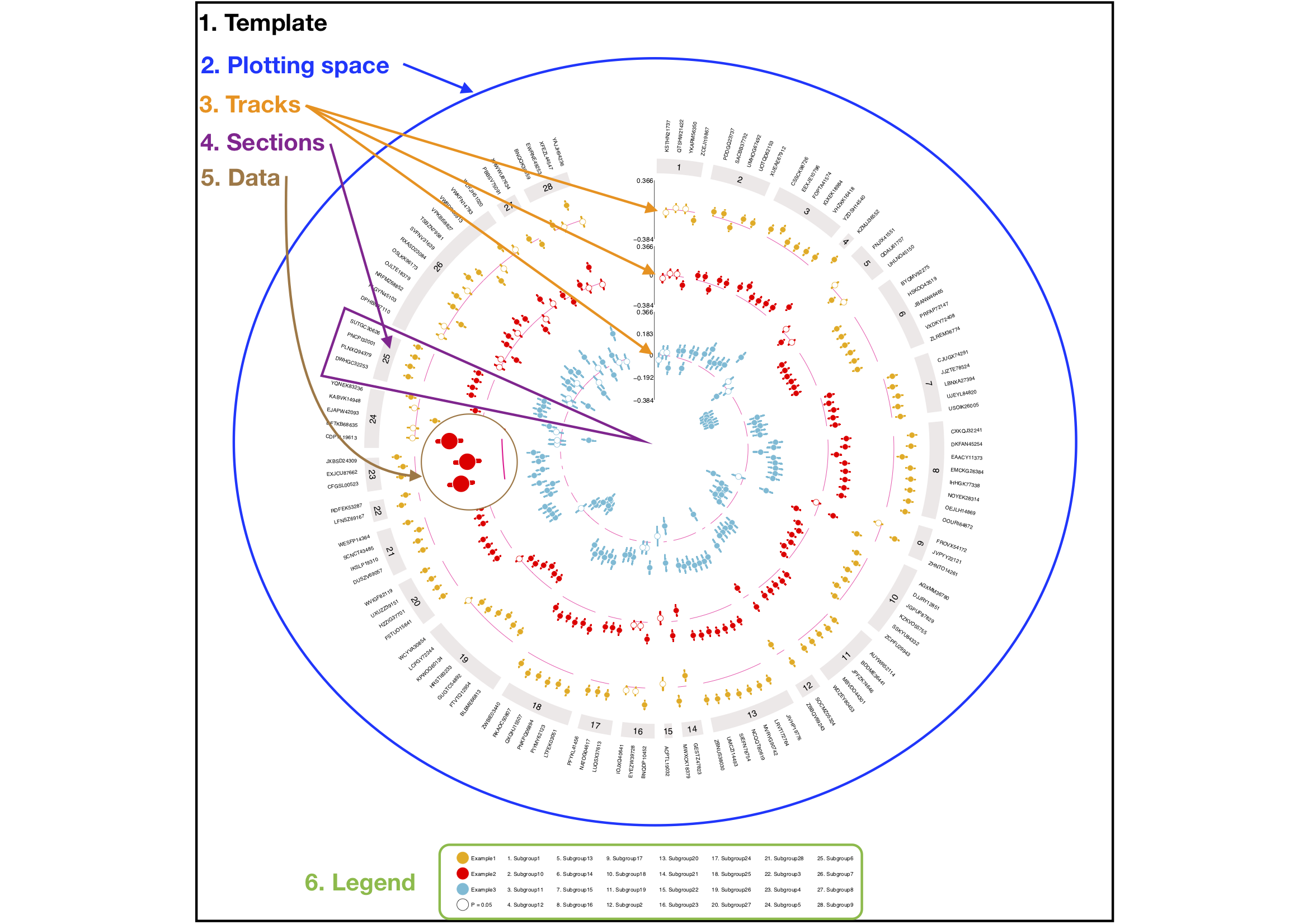
- Template: The square area containing the plot.
- Plotting Space: The circular area divided into sectors.
- Tracks: Rings within the plotting space.
- Sectors: Divisions of the circle based on data categories.
- Labels: Variable names on the outermost edge.
-
Legend: An explanatory key generated via
ComplexHeatmap.