Visualisation
visualisation.RmdVisualization Gallery
The functions package provides a robust suite of
visualization tools for GWAS and MR results.
1. Manhattan Plots
The manhattan function is now fully generic, allowing
for genome-wide grouping or any categorical X-axis.
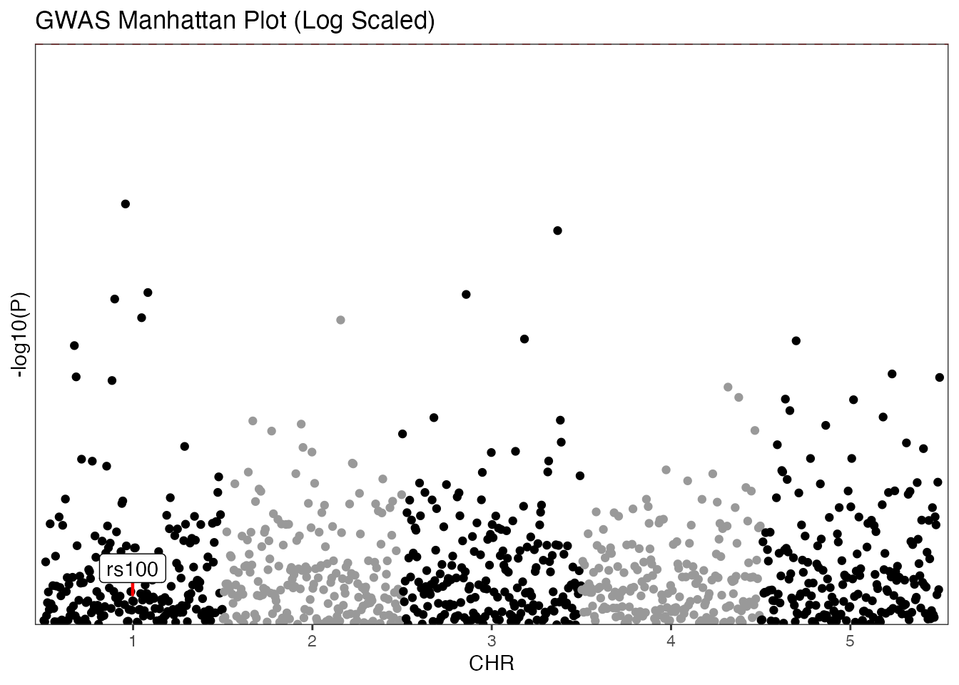
GWAS Example (Traditional)
Standard Manhattan plot using chromosome and base-pair positions with log transformation.
# Mock GWAS data
set.seed(42)
gwas_data <- data.frame(
  SNP = paste0("rs", 1:1000),
  CHR = rep(1:5, each = 200),
  BP = rep(1:200, times = 5),
  P = runif(1000)
)

manhattan(gwas_data,
  group = "CHR",
  position = "BP",
  value = "P",
  yline = 5,
  logy = TRUE,
  highlight_colour = "green3",
  annotate_column = "SNP",
  annotate = "rs100",
  colours = c("black", "gray60"),
  title = "GWAS Manhattan Plot (Log Scaled)"
)
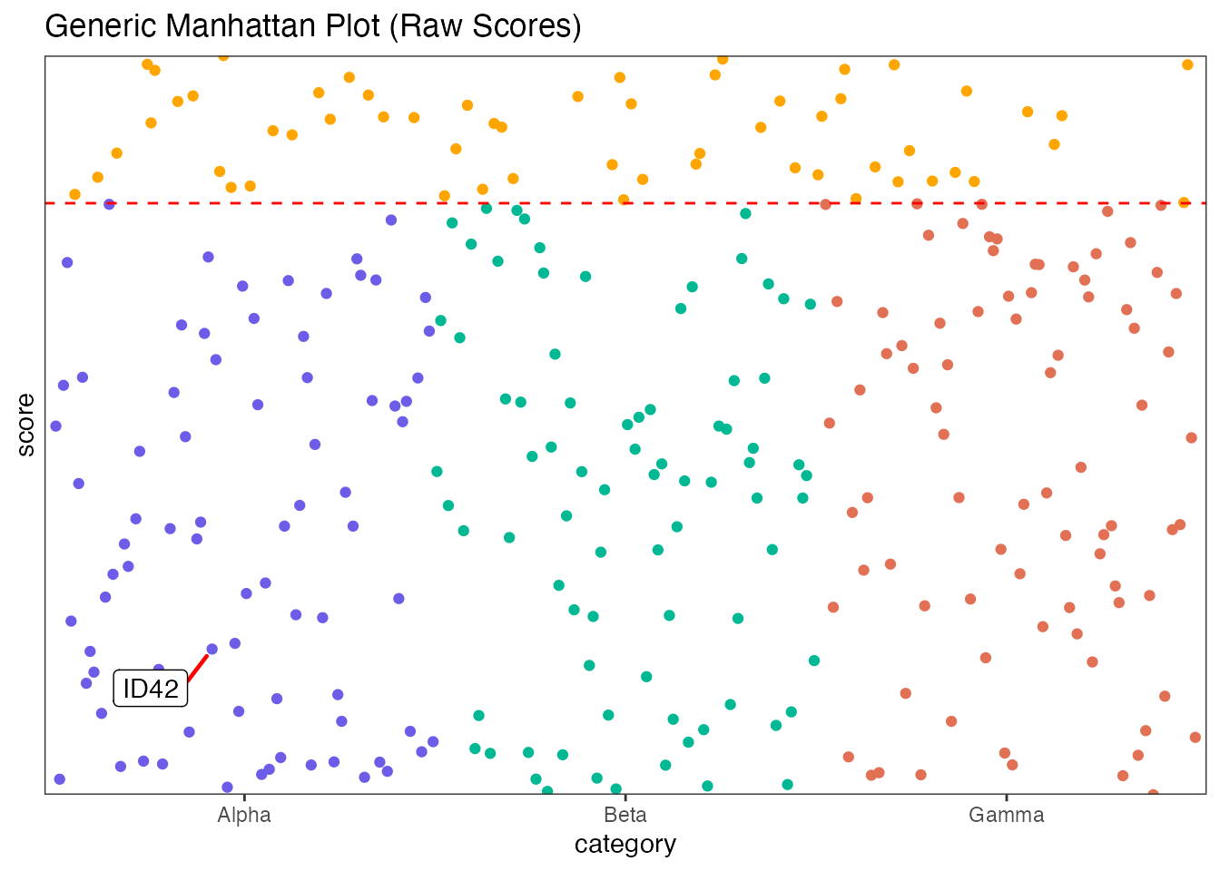
Generic Example
Using arbitrary categories and raw scores.
generic_data <- data.frame(
  category = rep(c("Alpha", "Beta", "Gamma"), each = 100),
  index = rep(1:100, times = 3),
  score = runif(300, 0, 10),
  label = paste0("ID", 1:300)
)

manhattan(generic_data,
  group = "category",
  position = "index",
  value = "score",
  yline = 8,
  logy = FALSE,
  highlight_colour = "orange",
  annotate_column = "label",
  annotate = "ID42",
  colours = c("#6c5ce7", "#00b894", "#e17055"),
  title = "Generic Manhattan Plot (Raw Scores)"
)
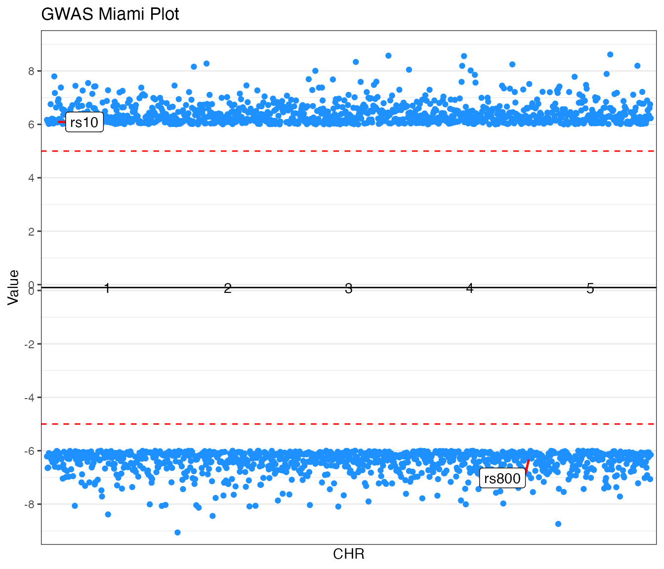
2. Miami Plots
Miami plots provide a mirrored view of two datasets, ideal for
comparing results from two different studies (e.g., GWAS traits) for the
same genetic markers. The function accepts value_top and
value_bottom columns and handles the mirroring
automatically.
GWAS Example (Traditional)
Comparing p-values from two traits.
# Mock GWAS Miami data
set.seed(821)
miami_gwas <- data.frame(
  SNP = paste0("rs", 1:1000),
  CHR = rep(1:5, each = 200),
  BP = rep(1:200, times = 5),
  P_trait1 = runif(1000, 0, 1e-6),
  P_trait2 = runif(1000, 0, 1e-6)
)

miamiplot(miami_gwas,
  group = "CHR",
  position = "BP",
  value_top = "P_trait1",
  value_bottom = "P_trait2",
  yline_top = 5,
  yline_bottom = 5,
  logy = TRUE,
  highlight_colour = "dodgerblue",
  annotate_column = "SNP",
  annotate_top = "rs10",
  annotate_bottom = "rs800",
  colours = c("#2d3436", "#636e72"),
  title = "GWAS Miami Plot"
)
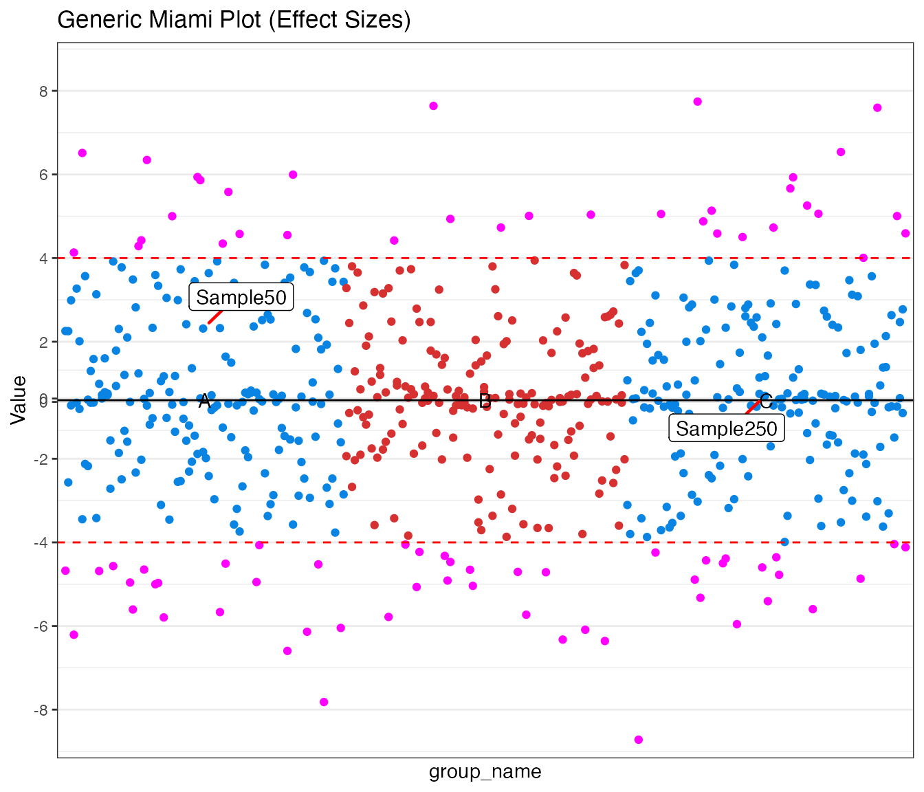
Generic Example
Comparing effect sizes (beta values) between two custom groups.
miami_generic <- data.frame(
  group_name = rep(c("A", "B", "C"), each = 100),
  pos = rep(1:100, times = 3),
  beta_trait1 = rnorm(300, 2, 2),
  beta_trait2 = rnorm(300, 2, 2),
  id = paste0("Sample", 1:300)
)

miamiplot(miami_generic,
  group = "group_name",
  position = "pos",
  value_top = "beta_trait1",
  value_bottom = "beta_trait2",
  yline_top = 4,
  yline_bottom = 4,
  logy = FALSE,
  highlight_colour = "magenta",
  annotate_column = "id",
  annotate_top = "Sample50",
  annotate_bottom = "Sample250",
  colours = c("#0984e3", "#d63031"),
  title = "Generic Miami Plot (Effect Sizes)",
  transformation_from = -1,
  transformation_to = 1,
  transformation = 5
)

3. Regional and Locus Plots
Focused association plots for specific loci.
gg_regionplot (LocusZoom style)
Attempts to fetch recombination rates and gene annotations.
# Mock regional data
region_data <- data.frame(
  SNP = paste0("rs", 1:100), CHR = 2,
  pos = seq(10e6, 10.5e6, length.out = 100),
  EA = "T", OA = "C",
  beta = rnorm(100), se = runif(100, 0.1, 0.3),
  p_value = 10^(-runif(100, 1, 8)),
  phenotype = "Trait A"
)

# Render regional plot (with fallback)
try(
  {
    p <- gg_regionplot(region_data, rsid = "SNP", chrom = "CHR", pos = "pos", p_value = "p_value", label = "rs10")
    print(p)
  },
  silent = TRUE
)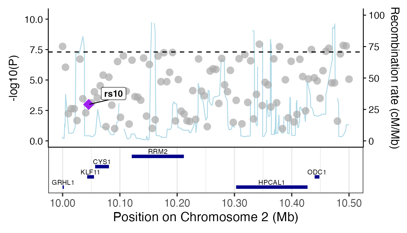
# Render locus plot (with fallback)
try(
  {
    gg_locusplot(region_data,
      rsid = "SNP", p_value = "p_value", pos = "pos",
      chrom = "CHR", ref = "EA", alt = "OA"
    )
  },
  silent = TRUE
)
3. Forest Plots
The forestplot function supports optional side labels
for extra context (e.g., sample sizes, specific study IDs).
Standard Forest Plot (No Labels)
# MR-style results
forest_df <- data.frame(
  name = c("Study 1", "Study 2", "Study 3", "Meta-analysis"),
  estimate = c(0.5, 0.3, 0.7, 0.52),
  se = c(0.1, 0.12, 0.08, 0.05),
  pvalue = c(0.001, 0.015, 0.0001, 0.00001)
)

forestplot(forest_df, name = name, estimate = estimate, se = se, pvalue = pvalue, title = "Standard Forest Plot")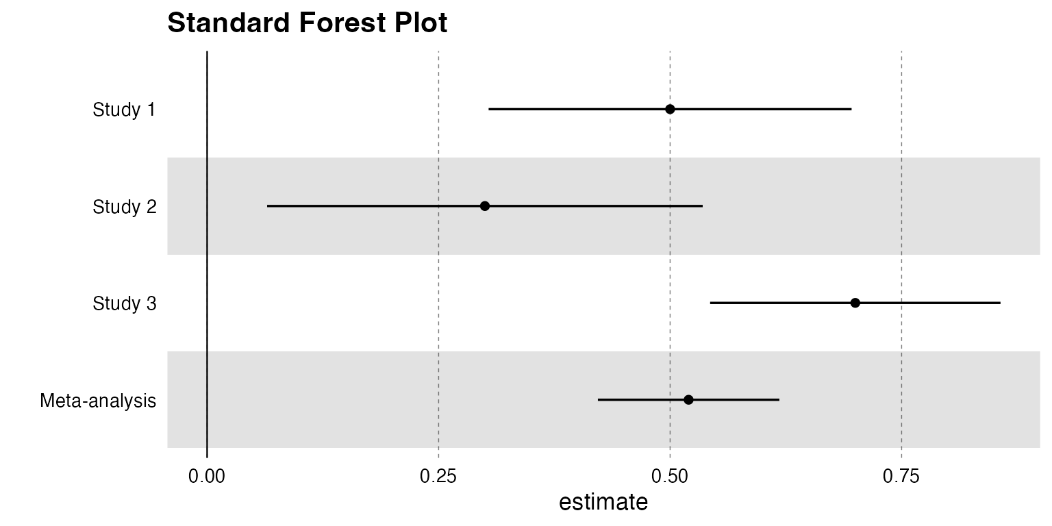
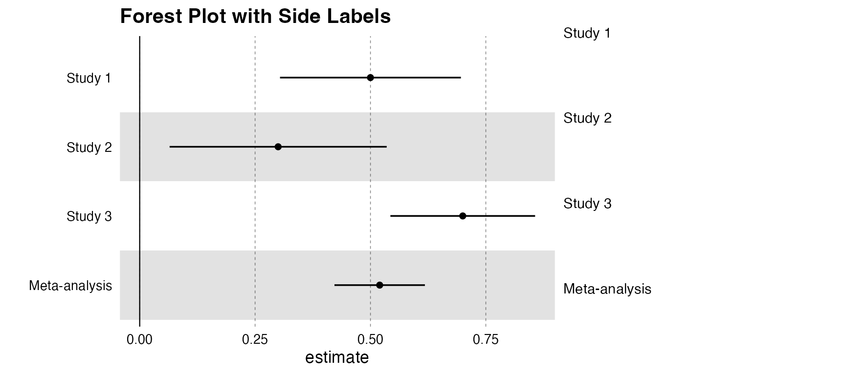
Forest Plot with Labels
# Providing a label_column activates the dual-pane visualization
forestplot(forest_df,
  name = name, estimate = estimate, se = se, pvalue = pvalue,
  label_column = name, label_width = 0.5, title = "Forest Plot with Side Labels"
)
4. LocusComparer
The unified locuscomparer function serves as a single
entry point for all comparison plot types.
A. Combined View (LocusCompare + LocusZoom)
# Prepare mock data
set.seed(1)
snps <- paste0("rs", 1:50)
data_exp <- list(
snp = snps,
pval = runif(50, 0, 0.001),
position = seq(1e6, 1.1e6, length.out = 50),
LD = matrix(runif(50 * 50, 0, 1), 50, 50, dimnames = list(snps, snps))
)
diag(data_exp$LD) <- 1
data_out <- list(snp = snps, pval = runif(50, 0, 0.01))
# Combined plot logic
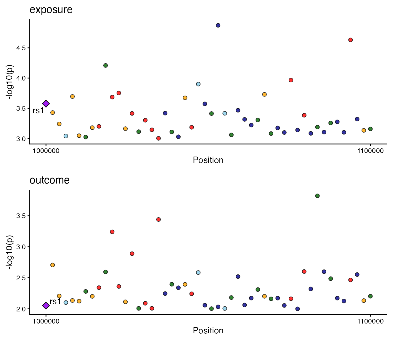
locuscomparer(data_exp, data_out, SNP_causal_exposure = "rs1", type = "combined")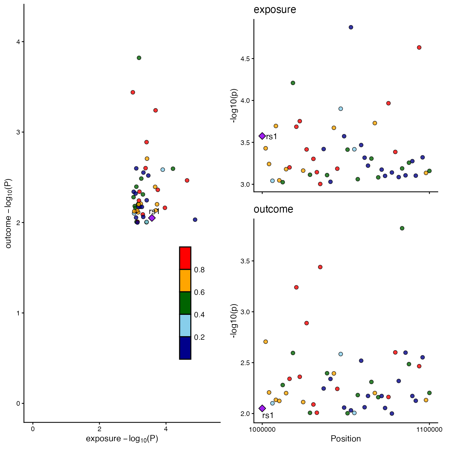
B. Scatter Plot only
locuscomparer(data_exp, data_out, SNP_causal_exposure = "rs1", type = "scatter")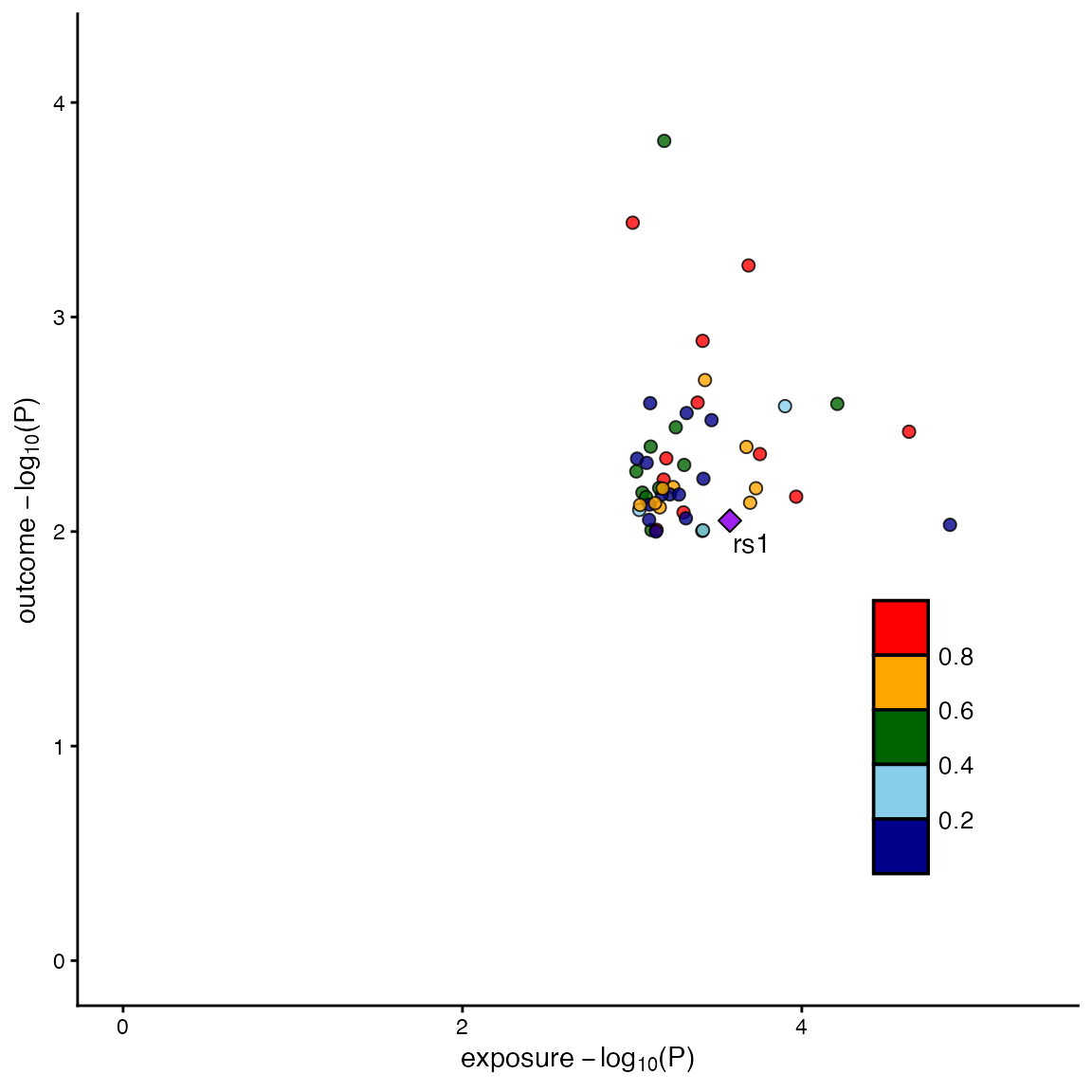
C. LocusZoom only
locuscomparer(data_exp, data_out, SNP_causal_exposure = "rs1", type = "locuszoom")